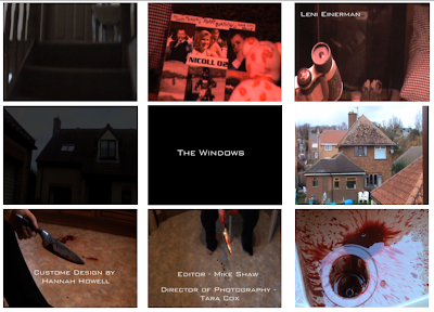
Key Frame 1 is of camera movement. This shot is quite slow movement as it pans up the stairs which I think is very effective in making suspense and fits in well with the thriller theme.
Key Frame 2 is lighting. The light in this shot is red, the light in this shot is created by having red blinds shut on a very sunny day. I didn't plan using red lighting but after shooting it a few times with and without the red lighting and found that the red lighting made the shot look more dramatic. Also I think it fit's well with the blood that the opening title sequence is based around.
Key Frame 3 is framing. I really like this shot, it is my favorite shot in the opening sequence. As the shot begins it is of a fish swimming around a fish tank, it makes the audience think that the fish is important and what the shot is based around, but then it zooms out and reveals a pair of binoculars. The framing in this shot is good because it makes the binoculars appear as though they are floating. I think that this shot fits very well with the triller theme of the film, it adds a lot of suspense as the audience will then want to know why the binoculars a relevant to the rest of the film.
Key Frame 4 is transition. This shot is just a simple fade-out. I didn't use any other transitions other than fade-in and fade-out because it takes the audiences attention away from the film opening.
Key Frame 5 is typography. This shot is of the title of my film, most of the titles in my opening are actually on the shots but I felt that it would be better to put the title of the film on a black background as it is to separate the shots between david's house and holly's house. The font I used was 'bank gothic', I chose this font because I felt that it needed to be simple, easy to read, fit in with the triller genre, but I didn't want it to be boring.
Key Frame 6 is setting. This shot is just a simple house that zooms in on one of the upstairs windows. The shot of the house shows the audience that the setting is just an ordinary suburban street. The fact that the shot then zooms in, adds tension because the audience is waiting to see what is happening inside the house.
Key Frame 7 is narrative. I chose this shot as my narrative shot because this is the first shot that shows the knife and the blood. This is the first shot that shows the audience the intense thriller theme. Before this shot the audience doesn't have a very good idea of what the film will involve.
Key Frame 8 is costumes and props. This shot shows that the main props in the opening are the knife and the blood, there are quite a few other important props in the opening but the knife and blood are the important to the rest of the film and to the triller genre. This shot shows only one piece of costume, the trousers of the girl (holly). Her trousers are just plain black. The props and costume are in this shot because I think it takes away some of the suspense to have too much going on in a shot.
Key Frame 9 is visual effects. This shot is the blood in the sink. I think that the way the blood drips and runs down the sink fits very well with the genre as it adds a lot of suspense because the audience doesn't know where the blood dripping is coming from.
...I didn't base any of shots on particular shots from other films or television shows. Although my title sequence in general has some parts, such as the zooming in on the house, which are based around the zooming in on the suburban street in the opening of american beauty. There are quite a few things about my opening that resemble the opening to american beauty, like the shot of objects that people pick up, or some feet as they are moving, or close-up of people's hands whilst doing somethings instead of showing their faces.


 My film opening sequence represents the character group of murderers in films.


